Creating professional GPS track profiles transforms raw elevation data into compelling visual stories that reveal the true character of any route or trail.
Whether you’re planning a mountain bike adventure, documenting a challenging hike, or analyzing athletic performance, understanding how to properly visualize and interpret elevation changes is an essential skill. GPS track profiles provide more than just pretty graphs—they offer critical insights into terrain difficulty, energy expenditure, and route characteristics that flat maps simply cannot convey.
The elevation profile has become a universal language among outdoor enthusiasts, athletes, and geographic professionals. From ultramarathon runners studying race courses to urban planners assessing accessibility, these visual representations of vertical gain and loss communicate information instantly and effectively. Learning to create and refine these profiles opens up new possibilities for route planning, performance analysis, and sharing your outdoor experiences with precision and impact.
📊 Understanding the Fundamentals of GPS Track Profiles
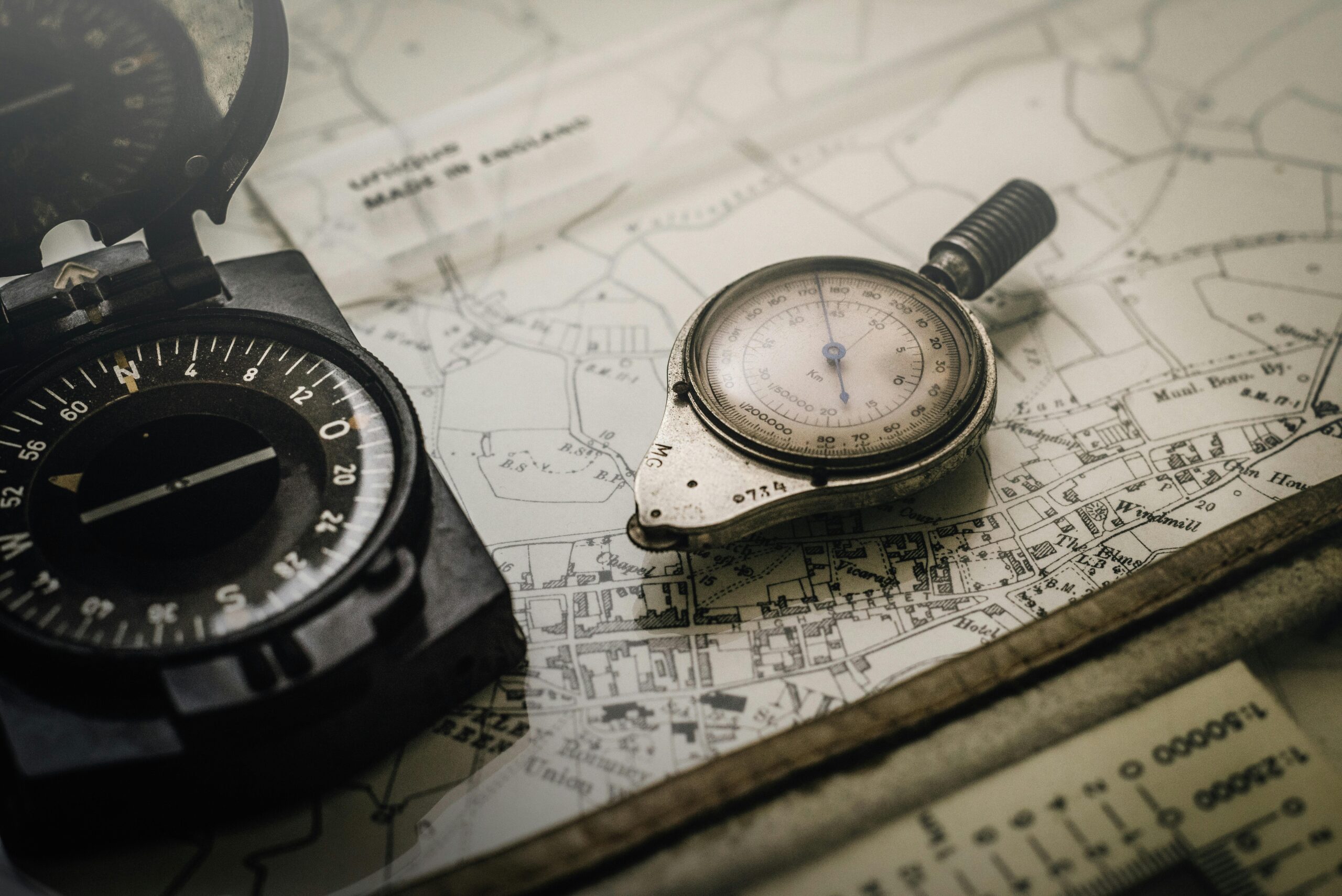
A GPS track profile is essentially a two-dimensional graph that displays elevation on the vertical axis and distance or time on the horizontal axis. This simple visualization transforms complex three-dimensional terrain into an easily digestible format that highlights climbs, descents, and flat sections at a glance.
The quality of your track profile depends entirely on the accuracy of your source data. Modern GPS devices and smartphones collect elevation information through various methods, including barometric pressure sensors, satellite triangulation, and database lookups. Barometric altimeters generally provide more consistent results, especially in areas with good atmospheric pressure stability, while pure GPS elevation can be subject to vertical error margins of 10-20 meters or more.
Understanding sampling rate is crucial for professional results. GPS devices record waypoints at intervals ranging from once per second to once every several seconds. Higher sampling rates capture more detail but create larger file sizes and can introduce more noise into your data. Most quality tracks benefit from sampling rates between one and five seconds, striking a balance between detail and manageability.
The Anatomy of Quality Elevation Data
Professional-grade GPS tracks contain several key data points at each recorded location: latitude, longitude, elevation, timestamp, and sometimes additional metrics like heart rate or cadence. The elevation component specifically requires careful attention because it’s typically the least accurate measurement from standard GPS receivers.
Elevation noise—those jagged, unrealistic spikes in your raw data—stems from GPS signal bounce, atmospheric interference, and device limitations. A person standing still might show elevation fluctuations of 5-15 meters in raw GPS data. This noise becomes problematic when creating profiles, making smooth trails appear impossibly jagged and distorting cumulative elevation gain calculations.
🛠️ Essential Tools for Creating Track Profiles
The landscape of GPS track profile creation spans from simple smartphone apps to sophisticated desktop software. Your choice of tools depends on your specific needs, technical comfort level, and desired output quality.
Mobile applications offer convenience and immediate processing capabilities. Apps like Gaia GPS, Komoot, and AllTrails allow you to record tracks and generate profiles on-the-go, with varying degrees of customization and export options. These solutions work well for casual users and those who prioritize speed over extensive customization.
Desktop software provides more powerful processing capabilities and finer control over output. Programs like GPXSee, Golden Cheetah, and BaseCamp offer advanced filtering options, multiple export formats, and detailed customization of profile appearance. Web-based platforms such as GPS Visualizer and Ride with GPS strike a middle ground, offering robust features without installation requirements.
For professionals requiring maximum control, GIS software like QGIS combined with digital elevation models (DEMs) enables elevation correction and analysis at the highest level. This approach replaces potentially inaccurate GPS elevation data with verified terrain models, though it requires more technical expertise.
🎯 Cleaning and Smoothing Your GPS Data
Raw GPS tracks almost always require processing before they’re suitable for professional presentation. The cleaning process involves removing errors, smoothing noise, and sometimes augmenting data with more accurate elevation sources.
The first step in data cleaning involves removing obvious outliers—those impossible spikes where your elevation suddenly jumps 50 meters and back in a few seconds. Most quality software includes outlier detection algorithms that identify and eliminate these errors automatically, though manual review remains important for catching edge cases.
Smoothing algorithms reduce the jagged appearance of elevation profiles by averaging nearby data points. Moving average filters, Gaussian smoothing, and spline interpolation each offer different characteristics. Light smoothing preserves terrain character while removing obvious noise, whereas aggressive smoothing can mask real elevation changes and distort cumulative gain calculations.
The Art of Balanced Smoothing
Finding the right smoothing level requires understanding your terrain and intended use. Mountain trails with rapid elevation changes need lighter smoothing to preserve their character, while road cycling routes can typically handle more aggressive processing. Over-smoothing creates unrealistic profiles that misrepresent actual climbing, while under-smoothing leaves distracting noise.
A practical approach involves testing different smoothing parameters and comparing cumulative elevation gain. If smoothing changes your total gain by more than 10-15%, you’ve likely gone too far. Visual inspection should show a profile that follows terrain logic—smooth where terrain is actually smooth, variable where it’s genuinely rough.
📈 Calculating Accurate Elevation Statistics
Cumulative elevation gain and loss are among the most valuable statistics derived from GPS profiles, but they’re also among the most commonly miscalculated. Small errors in methodology can result in dramatically different numbers, causing confusion and misrepresentation of route difficulty.
The threshold method provides the most reliable approach to calculating elevation gain. This technique only counts elevation changes that exceed a specified threshold—typically 3-5 meters. Changes smaller than the threshold are ignored as noise. This prevents accumulating thousands of meters of false gain from GPS bounce while still capturing all legitimate climbing.
Different software uses different calculation methods, which explains why the same GPS file can show varying elevation statistics across platforms. Understanding your tool’s methodology helps you interpret results accurately and communicate them clearly to others.
Understanding Elevation Gain Metrics
Gross elevation gain counts every meter of climbing regardless of descent between climbs. Net elevation gain simply subtracts ending elevation from starting elevation. For most routes, gross gain provides much more useful information about actual work required, since descending and re-climbing counts toward effort even if you end at the same elevation where you started.
Elevation loss deserves equal attention, particularly for route planning. Steep descents can be harder on the body than equivalent climbs, and knowing total descent helps predict the full physical demand of a route.
🎨 Designing Visually Compelling Profiles
Professional GPS track profiles balance information density with visual clarity. The goal is communicating terrain characteristics instantly while providing detailed data for closer inspection.
Color choice significantly impacts profile readability. Solid fill beneath the elevation line helps viewers quickly grasp the overall shape, while color gradients can encode additional information like grade or surface type. Stick to colorblind-friendly palettes when your work will reach broad audiences—blues, oranges, and purples typically work better than reds and greens.
Scale selection determines whether your profile emphasizes or minimizes elevation changes. Exaggerated vertical scales make small hills look like mountains, while compressed scales can make brutal climbs appear gentle. Professional profiles typically use a vertical:horizontal ratio between 1:5 and 1:10 for balanced representation, though this varies by terrain and purpose.
Adding Context with Annotations
Strategic annotations transform basic profiles into informative guides. Mark significant waypoints like summits, water sources, or trail junctions directly on the profile. Include distance markers along the horizontal axis so viewers can correlate features with their position on route. Gradient zones or color coding can highlight particularly steep sections that require special attention.
Grade overlays provide immediate insight into climb difficulty. Rather than just showing the elevation line, color-code segments by percentage grade—perhaps green for 0-5%, yellow for 5-10%, orange for 10-15%, and red for anything steeper. This visual encoding lets viewers instantly identify the most challenging sections.
🔍 Advanced Techniques for Professional Results
Moving beyond basic profiles opens up sophisticated analysis possibilities. Three-dimensional visualizations combine GPS tracks with terrain models to show routes in geographic context. These perspective views help viewers understand how trails wind through landscape features and provide more intuitive spatial understanding than flat profiles.
Comparative profiles overlay multiple routes to analyze alternatives or show performance variations over time. Athletes can compare different attempts at the same course, while route planners can evaluate options side-by-side. Ensure clear visual differentiation between overlaid profiles through contrasting colors and line styles.
Grade distribution histograms complement traditional profiles by showing how much distance falls into different steepness categories. This statistical view helps predict overall route character—a trail with most distance in moderate grades feels very different from one with equal amounts of flat and steep, even if average grade is identical.
Integrating Additional Data Layers
Modern GPS devices and smartphone apps capture far more than just position and elevation. Heart rate, power output, speed, and cadence can all be overlaid onto elevation profiles to reveal correlations between terrain and performance. These multi-metric profiles become powerful training tools, showing exactly where effort increased or efficiency decreased.
Environmental data like temperature, humidity, or even surface type adds another dimension to professional profiles. For published route guides, indicating sections with different trail surfaces, exposure levels, or typical seasonal conditions helps users prepare appropriately.
📱 Optimizing Profiles for Different Platforms
The intended display platform significantly influences how you should design your GPS track profiles. What works perfectly on a large desktop monitor may become illegible on a smartphone screen, while profiles optimized for printing require different considerations than those for web display.
Mobile-first design emphasizes simplicity and bold visual elements. Use larger fonts, thicker lines, and higher contrast ratios to ensure readability on small screens. Minimize annotations to only the most critical waypoints, as crowded mobile profiles become confusing rather than helpful. Interactive profiles that reveal detail on tap work particularly well for smartphone applications.
Print-optimized profiles need careful attention to resolution and sizing. Export at minimum 300 DPI for publication quality, and consider how the profile will scale to page size. Black and white printing limitations may require redesigning color-coded profiles to use patterns or line styles instead of color differentiation.
⚡ Common Pitfalls and How to Avoid Them
Even experienced creators make recurring mistakes when generating GPS track profiles. Recognizing these common issues helps you avoid them in your own work and critically evaluate profiles from other sources.
Over-smoothing ranks among the most frequent errors, creating profiles that look clean but misrepresent actual terrain. When someone attempts your route based on an over-smoothed profile, they’ll encounter more climbing and difficulty than expected. Always verify that processed elevation gain remains within reasonable range of raw data totals.
Misleading scale manipulation can make routes appear more or less challenging than reality. While some scale adjustment serves legitimate purposes, be transparent about vertical exaggeration. Many professional profiles include a note like “vertical scale exaggerated 8x” to maintain honesty.
Ignoring elevation data quality leads to publishing profiles based on poor GPS reception or uncalibrated sensors. If your source track came from a deep canyon, dense forest, or urban canyon where GPS accuracy suffers, consider replacing elevation data with DEM-based corrections rather than publishing compromised information.
🌟 Best Practices for Sharing and Publishing
Professional GPS track profiles deserve professional presentation and distribution. Format selection impacts both quality and accessibility—GPX files remain the universal standard for sharing raw data, while images serve presentation purposes, and interactive web profiles offer the best of both worlds.
When publishing profiles online, include comprehensive metadata: total distance, elevation gain and loss, highest and lowest points, average grade, and any relevant difficulty ratings. Explain your smoothing and calculation methodology so viewers understand what the numbers represent. Link to downloadable GPS files so others can analyze data with their preferred tools.
Licensing considerations matter when sharing GPS tracks. Clearly indicate whether you’re releasing data under open licenses like Creative Commons or retaining full rights. If your profile incorporates data from others—perhaps a professionally surveyed baseline—respect their licensing terms and provide attribution.

🚀 Putting Your Skills into Practice
Mastering GPS track profiles requires moving beyond theory into regular practice and experimentation. Start by recreating profiles of routes you know intimately, which lets you validate whether your processed data accurately represents real terrain character. This ground-truth testing builds intuition about appropriate smoothing levels and helps you recognize when profiles look wrong.
Build a workflow that balances efficiency with quality. Establish consistent processing steps—perhaps importing, outlier removal, smoothing, DEM correction, and annotation—that you apply systematically. Document your parameters so you can maintain consistency across multiple projects and explain your methodology to others.
Continuous learning keeps your skills sharp as tools and techniques evolve. Follow developments in GPS technology, try new software as it emerges, and study examples of exceptional profile design from professional sources. The GPS track profile community actively shares knowledge through forums and social media—engage with these resources to accelerate your growth.
Professional GPS track profiles represent far more than decorative graphics—they’re functional tools that communicate terrain characteristics with clarity and precision. By understanding data quality, mastering processing techniques, and thoughtfully designing visual presentations, you transform raw coordinates into compelling elevation stories. Whether documenting personal adventures, planning future expeditions, or publishing route guides for others, these skills ensure your profiles inform and inspire with professional polish and technical accuracy. The elevation data you collect on every outdoor adventure contains rich information waiting to be revealed through skilled profile creation.